Animated 2x2 Matrix Generator
Plot items across two axes in four quadrants. Export as PNG, SVG, GIF or MP4.
Free to try · No design skills · Ready in about two minutes
Trusted by 1,198 users, including people at
 ByteDance
 Arizona State
 Fox
Fox UT Austin
 Roche
Roche Tulane
 United Airlines
 Clemson
 NHS
NHS Ayming
 Marquette
 Kent State
 Ray White
 UC Riverside
 CBA
CBA Illinois Tech
 Venngage
 Hofstra
 House of Communication
 IIT Madras
 Sotherly Hotels
 Zenus.ai
Overview
What is a 2x2 matrix chart?
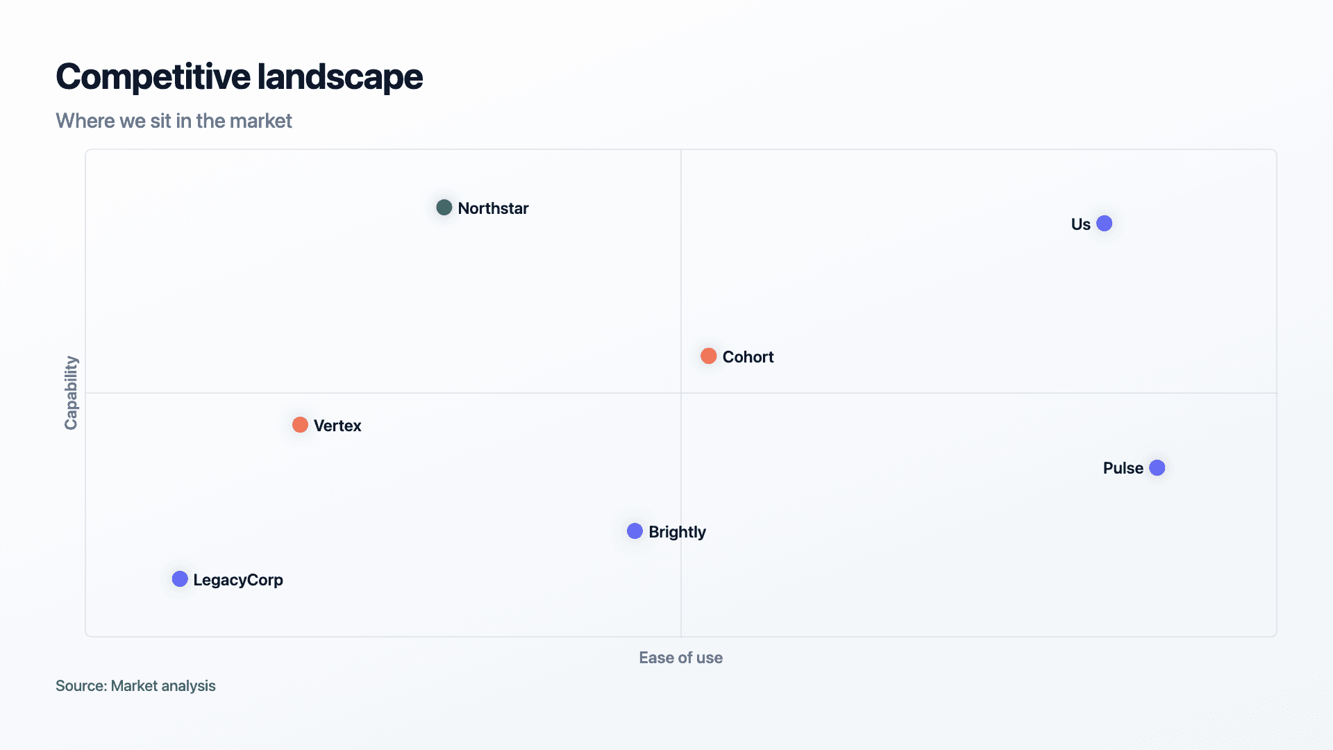
A 2x2 matrix plots items against two dimensions and splits the space into four quadrants. It is the classic consulting framework, effort versus impact, risk versus reward, price versus quality, and it works because two axes are enough to turn a messy comparison into a clear recommendation: this quadrant is where you want to be.
The power of the format is that it forces a point of view. Placing each item by its two values does more than describe; it sorts everything into 'do this', 'avoid that', 'quick win' or 'big bet'. That is why a 2x2 lands so well in a strategy deck, the quadrants carry an argument, not just data.
Reochart drops each item into place by its X and Y values, labels both axes and draws the quadrant lines, so a framework looks sharp enough for a client deck without any fiddling. Export as MP4, GIF, PNG or SVG, on your brand on Pro.
How it works
How a 2x2 matrix works
Each item has an X value (its position left to right) and a Y value (bottom to top), plus a label. Reochart positions every item in the plane, names both axes and divides the space into four quadrants so the groupings are obvious.
Use a consistent scale for each axis (say 1 to 10) so positions are comparable, and keep the item count modest so labels do not collide. The quadrant an item lands in is the whole message.
Examples
Example 2x2 matrix charts
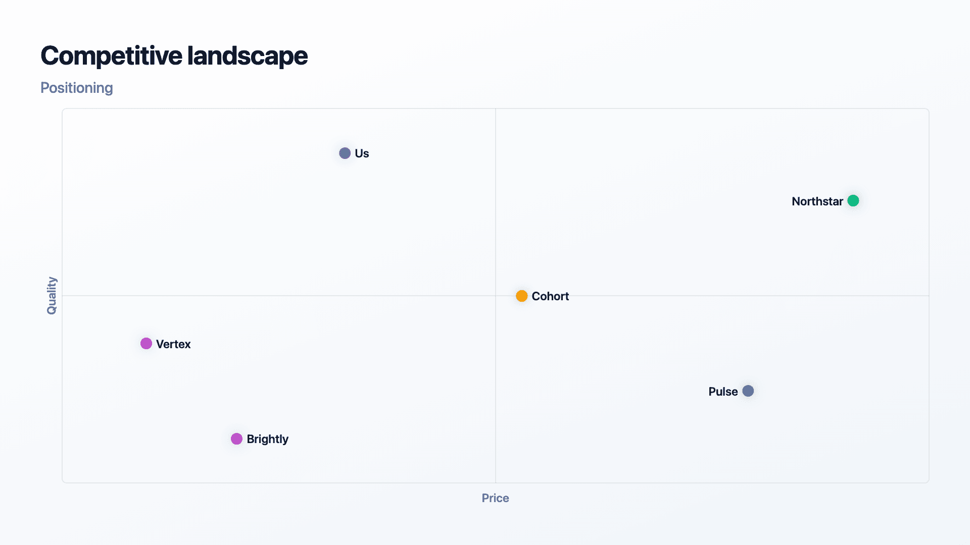
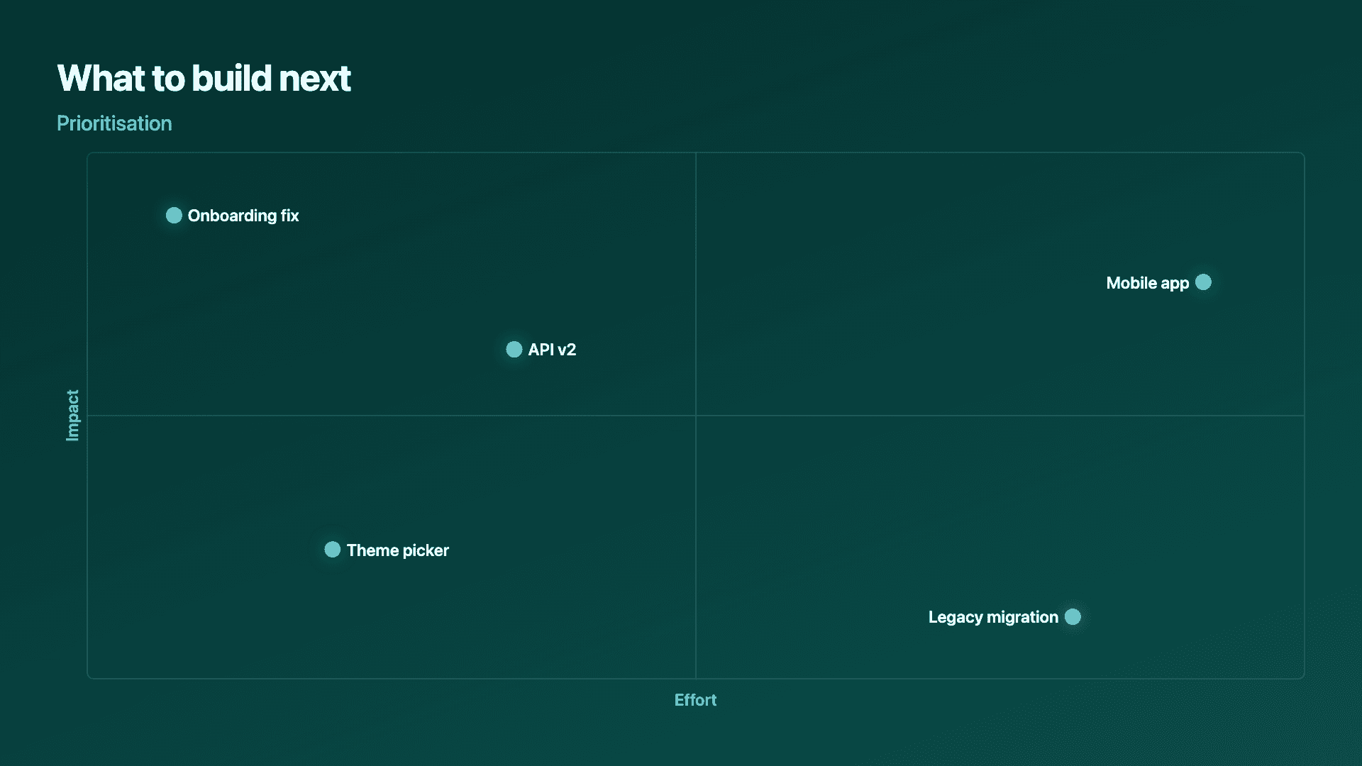
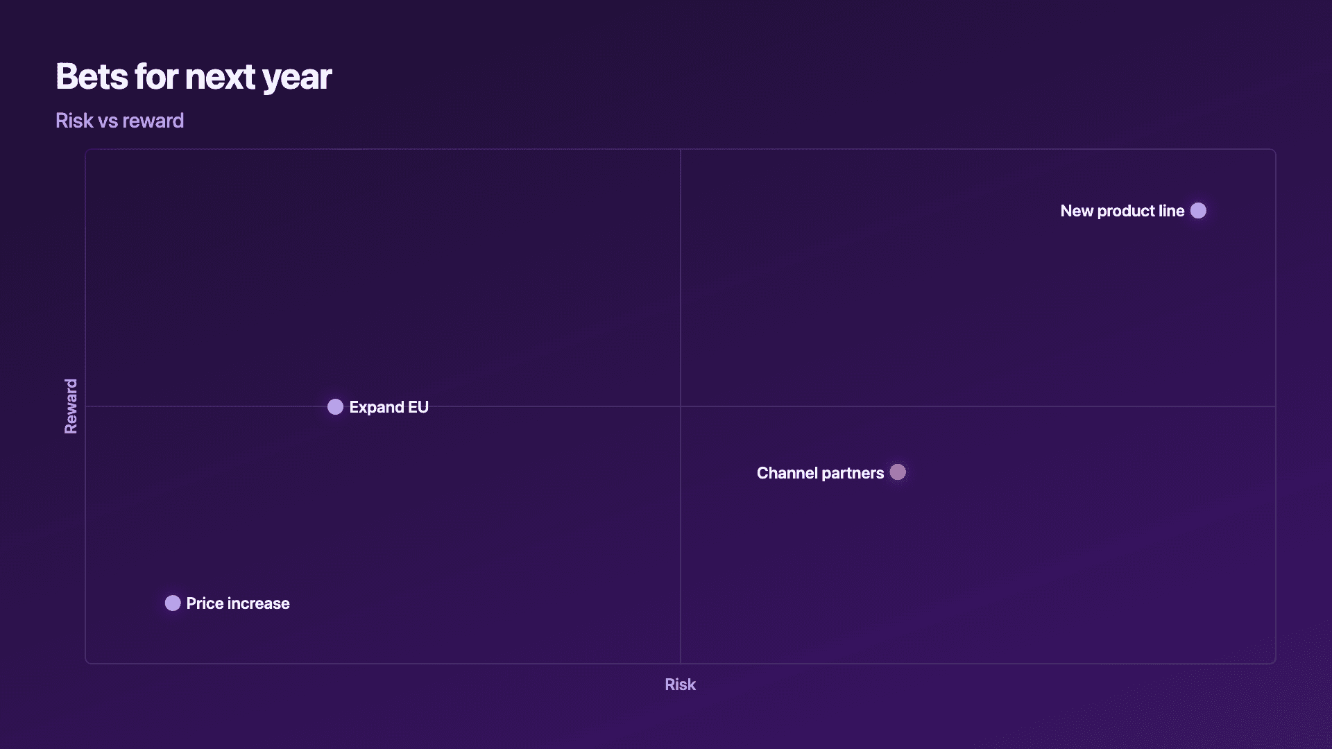
Real charts made in Reochart, each with its own data and theme. They animate automatically as you scroll.
Good fit
When to use a 2x2 matrix chart
- ✓Competitive positioning
- ✓Effort vs impact prioritisation
- ✓Risk vs reward comparison
- ✓Strategy and portfolio decisions
- ✓Any framework with two dimensions
Reach for something else
When not to use a 2x2 matrix chart
- ✕You have one dimension, use a bar or lollipop chart.
- ✕You are tracking change over time, use a line chart.
- ✕You have more than two meaningful variables, a 2x2 oversimplifies.
- ✕You have many items, labels collide; group or trim them.
Compare
2x2 matrix vs other charts
2x2 matrix vs the alternatives.
| Visual | Best for | Avoid when |
|---|---|---|
| 2x2 matrix | Positioning on two dimensions | A single-dimension ranking |
| Bar / lollipop | Ranking on one dimension | Two-axis positioning |
| Scatter plot | Many points, two continuous axes | A simple four-quadrant story |
| Line chart | A trend over time | A snapshot comparison |
Your data
What data you need
One row per item: a label, an X value and a Y value, plus a name for each axis. Use a consistent scale (like 1 to 10) so positions compare.
| Item | X | Y |
|---|---|---|
| Us | 4 | 9 |
| Northstar | 9 | 8 |
| Cohort | 6 | 6 |
| Vertex | 2 | 5 |
Step by step
How to make a 2x2 matrix chart
Drop your numbers in, or import a CSV.
Choose the chart, theme and animation speed.
Tune colours, labels and add your brand.
Download MP4, GIF, PNG or SVG.
Best practices
Get it right
- ✓Name both axes clearly so the quadrants make sense.
- ✓Use the same scale for every item on each axis.
- ✓Keep the item count modest so labels do not overlap.
- ✓Choose two dimensions that genuinely drive the decision.
- ✕Plot so many items the labels collide.
- ✕Pick axes that measure nearly the same thing.
- ✕Use it for a single-variable ranking.
- ✕Place items by gut feel without consistent scales.
Watch out
Common mistakes to avoid
Too many items turn the plane into a tangle of text. Trim to the players that matter or group the rest.
If both axes measure almost the same thing, items line up on a diagonal and the quadrants say nothing. Choose genuinely independent dimensions.
Eyeballing positions makes the matrix arbitrary. Score every item on the same scale so placements are defensible.
Some decisions have three or four real factors. A 2x2 is a simplification, name it as one rather than pretending it is the whole picture.
Why Reochart
Built for sharing, not just charting
- ✓No design skills required
- ✓Animated MP4 and GIF exports
- ✓PNG and scalable SVG too
- ✓Your brand colours and logo (Pro)
- ✓Paste from a sheet or import a CSV
- ✓Presentation and feed ready in minutes
FAQ
Frequently asked questions
What is a 2x2 matrix?
A 2x2 matrix positions items against two variables at once, splitting the space into four quadrants so that where something sits is itself the recommendation. It is the standard shape for prioritisation and positioning work: effort against impact tells a team what to build first, reach against cost tells a marketer where to spend, and market growth against share is the Boston Consulting Group's original growth-share matrix. The reason it persists in strategy work is that four labelled quadrants compress a judgement into something a room can argue about quickly, where a table of scores cannot. Its limitation is the same as its strength. Reducing two continuous dimensions to four boxes hides how close an item sits to a boundary, so an item just inside the do-it-now quadrant gets treated identically to one sitting deep inside it. Plot a handful of items rather than dozens and the labels stay readable.
Is a 2x2 matrix the same as a quadrant chart or a priority matrix?
Yes, these all name the same visual, and this page builds any of them. 2x2 matrix, quadrant chart, priority matrix and four-quadrant chart all mean items plotted against two axes with the space divided into four labelled regions. Named variants such as the Eisenhower matrix (urgency against importance), the effort-impact matrix and the BCG growth-share matrix are specific choices of axis on the same underlying chart.
What data do I need?
A label and an X and Y value for each item, plus a name for each axis. A consistent scale like 1 to 10 keeps positions comparable.
How many items can I plot?
Enough to make the comparison, but few enough that labels do not overlap, usually a handful. Group or trim a long list.
2x2 matrix or scatter plot?
A 2x2 is a simplified, quadrant-led version for strategy. A scatter plot suits many points on two continuous axes where the quadrants are not the point.
Can I make it animated?
Yes. Charts animate by default, and you can export the animation as an MP4 or GIF, or grab a static PNG or SVG if you prefer.
Can I export as SVG?
Yes. Pro exports a crisp, scalable SVG vector, alongside MP4, GIF and PNG. Every export renders at 1080p.
Is Reochart free?
Yes. The free plan lets you make every chart type except the animated bar chart race, and export an animated MP4 with a small watermark, no card needed. Pro adds the bar chart race, removes the watermark, and adds GIF and SVG, your brand colours and logo, longer videos and CSV import.
Keep exploring
Related generators
From the blog
Learn more about charts and data storytelling

11 min read
How to Create an Animated Number Counter
A step-by-step guide to building a number counter that actually lands: picking the number worth this treatment, setting an honest start point, adding the context that makes it mean something, and exporting an animated version for a launch post, a deck, or a milestone update.
Read article →

11 min read
How to Build a QBR Dashboard
A practical guide to building the handful of charts a quarterly business review actually needs: the growth number, the bridge that explains it, the pipeline read, the KPI scorecard, and the roadmap for what's next.
Read article →