Animated Number Counter Generator
Headline one big metric with a counting animation. Export as PNG, SVG, GIF or MP4.
Free to try · No design skills · Ready in about two minutes
Trusted by 1,198 users, including people at
 ByteDance
 Arizona State
 Fox
Fox UT Austin
 Roche
Roche Tulane
 United Airlines
 Clemson
 NHS
NHS Ayming
 Marquette
 Kent State
 Ray White
 UC Riverside
 CBA
CBA Illinois Tech
 Venngage
 Hofstra
 House of Communication
 IIT Madras
 Sotherly Hotels
 Zenus.ai
Overview
What is a number counter?
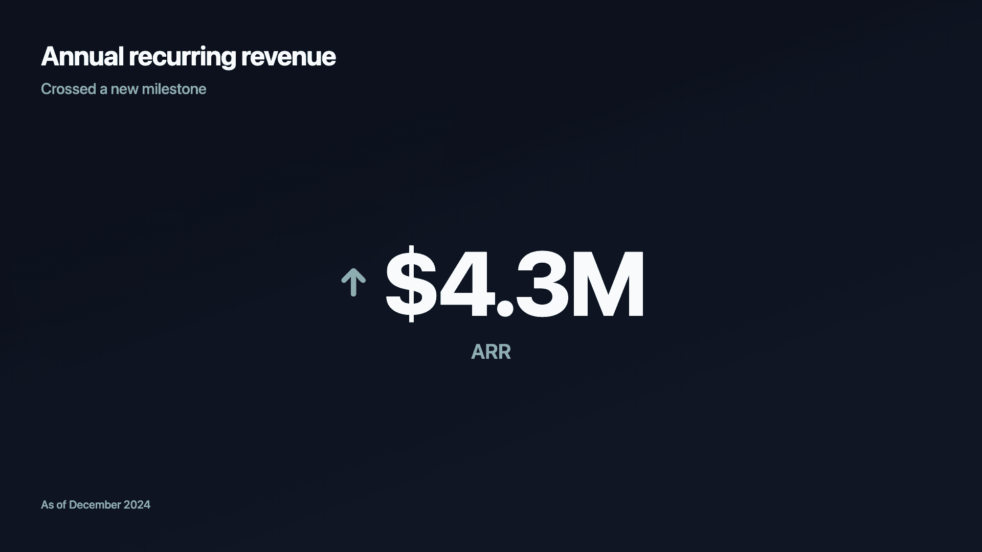
Sometimes one number is the whole story. An animated counter (also called a number counter generator) does nothing but that one number, ticking up from zero to your final figure with an optional currency prefix, a unit suffix and a trend arrow. There is no axis, no grid, no distraction, just the metric you want everyone to remember.
The number counter animation is what makes it work. A static stat is easy to scroll past; a number visibly climbing on screen pulls the eye and holds it for the second or two it takes to land. That makes it ideal for milestones and announcements, an ARR figure crossed, a user count hit, an uptime percentage you are proud of.
Because it carries so little, the counter lives or dies on the strength of the number itself. Use it for the figure that genuinely deserves a full frame, and let a richer chart handle anything that needs context or comparison. Reochart counts the value up on screen and exports as MP4, GIF, PNG or SVG, on your brand on Pro.
How it works
How a number counter works
You enter one value plus an optional prefix (like $), a suffix (like % or K) and a trend direction. Reochart animates the figure counting up from zero to that value, then holds on the final number so it can be screenshotted or used as a thumbnail.
Keep the label short, it sits under the number to say what it measures. The counter shows a single figure, so if you have several numbers to show at once, a KPI scorecard is the better fit.
Count up animation
Count up animation: settings for a smooth climb
A count up animation is the motion itself: a number ticking upward from zero until it lands on its final value. It's the same effect people call a number counter animation, a counting animation or a number going up animation, and it's exactly what this generator makes.
Reochart's count up starts at zero and eases out. It climbs quickly at first, then slows as it approaches the target, so the last digits settle into place instead of slamming to a stop. The final number then holds for the rest of the clip, which gives viewers time to read it and makes a clean thumbnail or screenshot.
Match the speed to the clip length
The count takes about 1.3 seconds on Fast, 1.9 on Normal and 2.6 on Slow. On a 3-second clip, Normal or Fast leaves the final number on screen long enough to read. Slow suits a 5-second clip (Pro), where the longer climb still has time to land.
Set decimals to match the figure
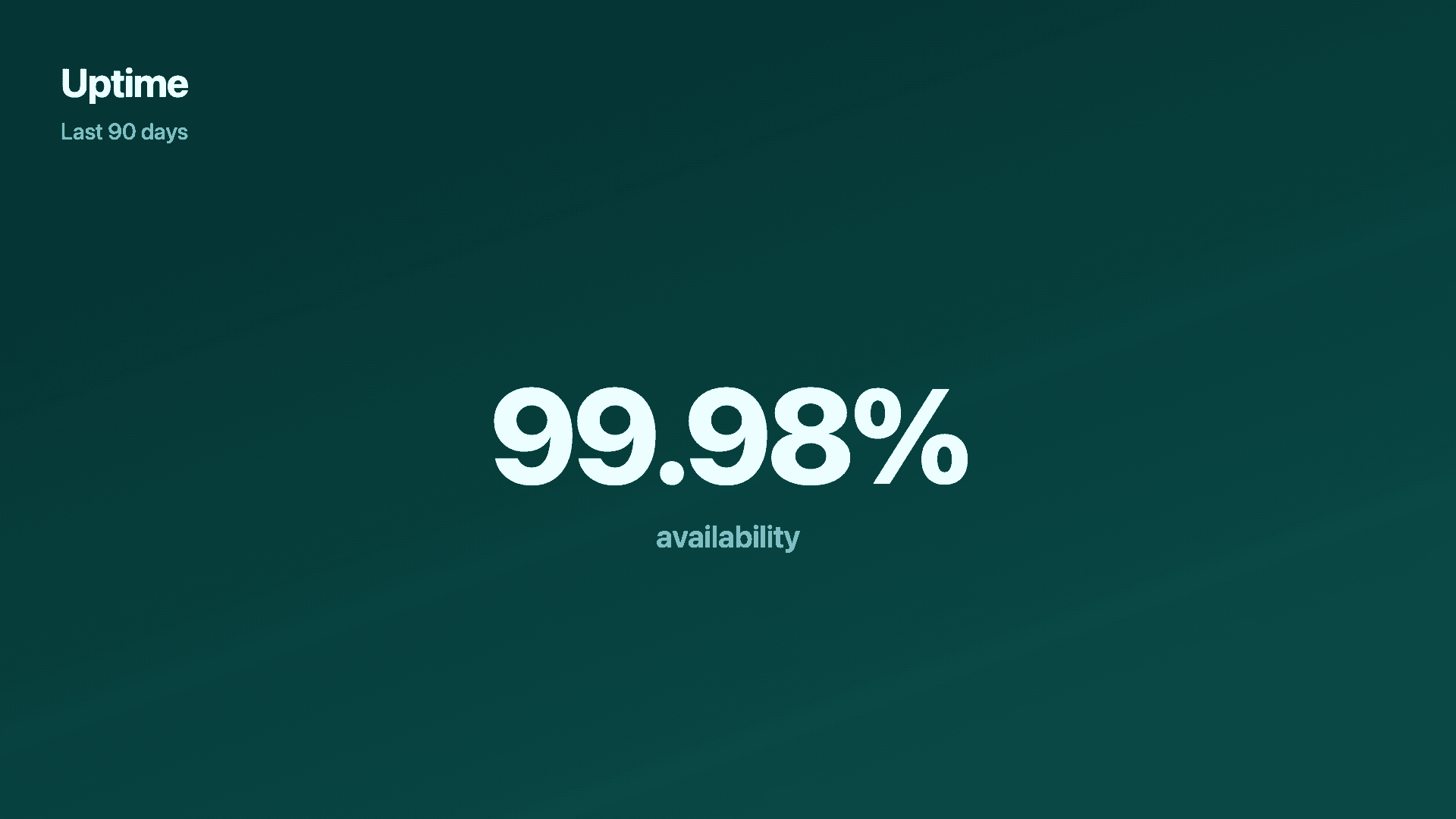
Choose 0, 1 or 2 decimal places. A count up to 99.98% needs two to land precisely; a user count reads best as a whole number.
Let big numbers abbreviate
Values of 100,000 and above are shown compactly, so a count up to 2,400,000 reads as 2.4M instead of a long run of digits. If your data is already in thousands or millions, set the value scale and the counter converts it for you.
Make the unit and direction obvious
Add a prefix like $ or a suffix like %, K or users so the unit is clear while the number climbs, plus an up or down arrow when the direction is part of the story.
Examples
Example number counters
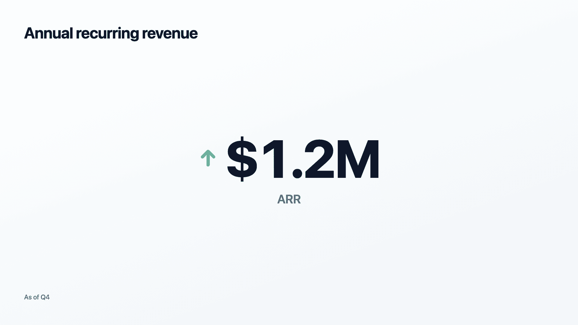
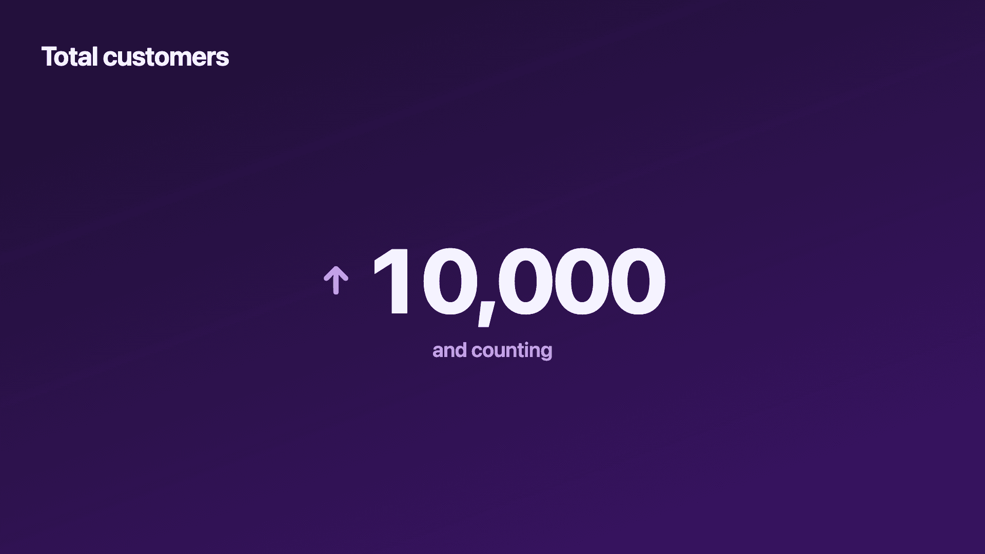
Real charts made in Reochart, each with its own data and theme. They animate automatically as you scroll.
Good fit
When to use a number counter
- ✓MRR or ARR milestones
- ✓Total signups, users or customers
- ✓A headline KPI in a launch post
- ✓A single percentage (uptime, growth, NPS)
- ✓An announcement that hinges on one figure
Reach for something else
When not to use a number counter
- ✕You have several numbers to show together, use a KPI scorecard.
- ✕The figure only means something next to a trend, use a line or area chart.
- ✕You are comparing categories, use a bar chart.
- ✕The number needs heavy caveats or context, a counter strips all of that away.
Compare
Number counter vs other charts
Number counter vs the alternatives.
| Visual | Best for | Avoid when |
|---|---|---|
| Number counter | One hero figure with impact | Several metrics at once |
| KPI scorecard | A handful of metrics together | A single headline number |
| Line / area | A figure in the context of a trend | A standalone milestone |
| Gauge | One value against a goal | A figure with no target |
Your data
What data you need
A single value plus an optional prefix, suffix and trend arrow. The label sits under the number to say what it measures.
| Label | Value |
|---|---|
| Annual recurring revenue | 1.2 |
| (prefix $, suffix M) |
Step by step
How to make a number counter
Drop your numbers in, or import a CSV.
Choose the chart, theme and animation speed.
Tune colours, labels and add your brand.
Download MP4, GIF, PNG or SVG.
Best practices
Get it right
- ✓Reserve it for a number that deserves a whole frame.
- ✓Use a prefix/suffix so the unit is unmistakable ($, %, K, M).
- ✓Keep the label to a few words.
- ✓Add an up or down arrow when direction is part of the story.
- ✕Cram several metrics into one counter frame.
- ✕Use it for a number that means nothing without context.
- ✕Round so hard the figure loses its credibility.
- ✕Add a trend arrow when there is no real trend.
Watch out
Common mistakes to avoid
A big figure with no comparison can mislead or underwhelm. If the metric only means something next to a trend, show the trend.
A counter is for one figure. Several metrics at once belong on a KPI scorecard.
Without a $ or % the viewer has to guess the unit. Always set a prefix or suffix.
An up arrow on a figure that is not actually growing reads as spin. Use the trend honestly.
Why Reochart
Built for sharing, not just charting
- ✓No design skills required
- ✓Animated MP4 and GIF exports
- ✓PNG and scalable SVG too
- ✓Your brand colours and logo (Pro)
- ✓Paste from a sheet or import a CSV
- ✓Presentation and feed ready in minutes
FAQ
Frequently asked questions
What is an animated number counter?
An animated number counter is a visual that gives a single figure a whole frame and animates it counting up from zero to its final value, usually with an optional currency prefix, a unit suffix and a trend arrow alongside it. There is no axis, no gridline and no second series competing for attention: the number is the entire chart. The format exists because some findings do not need comparison, they need emphasis. A revenue milestone, a total user count, an uptime percentage or a funds-raised figure lands harder as one number ticking upward than as a bar sitting next to other bars. The counting motion is what does the work, since a figure that arrives gradually holds the eye for the two or three seconds a static one does not, which is why counters are a staple of demo-day slides, launch videos and social posts.
What's the difference between a “number counter” and an “animated counter”?
No difference, they're the same tool by different names. A number counter animation, an animated counter and a number counter generator all do the same job here: you give it a value, it counts up from zero and lands on the total, with an optional prefix, suffix and trend arrow.
What is a count up animation?
A count up animation shows a number climbing from zero to its final value instead of appearing all at once. This counter makes one: enter your figure, pick a speed, and it counts up with an ease-out that slows as it reaches the total, then holds the final number. Export it as an MP4 or GIF to drop into a video, a slide or a social post.
Can I add a currency symbol or percent?
Yes. Set a prefix (like $) and a suffix (like % or M), plus an up or down trend arrow if direction matters.
Counter or KPI scorecard?
Use a counter for one hero figure that deserves a whole frame. Use a scorecard when you want to show several metrics together.
What is it best used for?
Milestones and announcements, an ARR figure, a user count, an uptime percentage, where a single number is the whole point.
Can I export the counter as a GIF?
Yes. Export as GIF for anywhere a video won't autoplay, Slack, email, or a page that needs it to loop without a play button. MP4 is the better choice for a social feed or a live presentation, since it holds a sharper image at a smaller file size.
Is this actually free, or is there a catch?
It's free to try with no signup required. The free plan includes three exports a month, and free exports carry a small Reochart watermark. Pro removes the watermark, lifts the monthly limit, and adds GIF and SVG export.
Can I make it animated?
Yes. Charts animate by default, and you can export the animation as an MP4 or GIF, or grab a static PNG or SVG if you prefer.
Can I export as SVG?
Yes. Pro exports a crisp, scalable SVG vector, alongside MP4, GIF and PNG. Every export renders at 1080p.
Is Reochart free?
Yes. The free plan lets you make every chart type except the animated bar chart race, and export an animated MP4 with a small watermark, no card needed. Pro adds the bar chart race, removes the watermark, and adds GIF and SVG, your brand colours and logo, longer videos and CSV import.
Keep exploring
Related generators
From the blog
Learn more about charts and data storytelling
11 min read
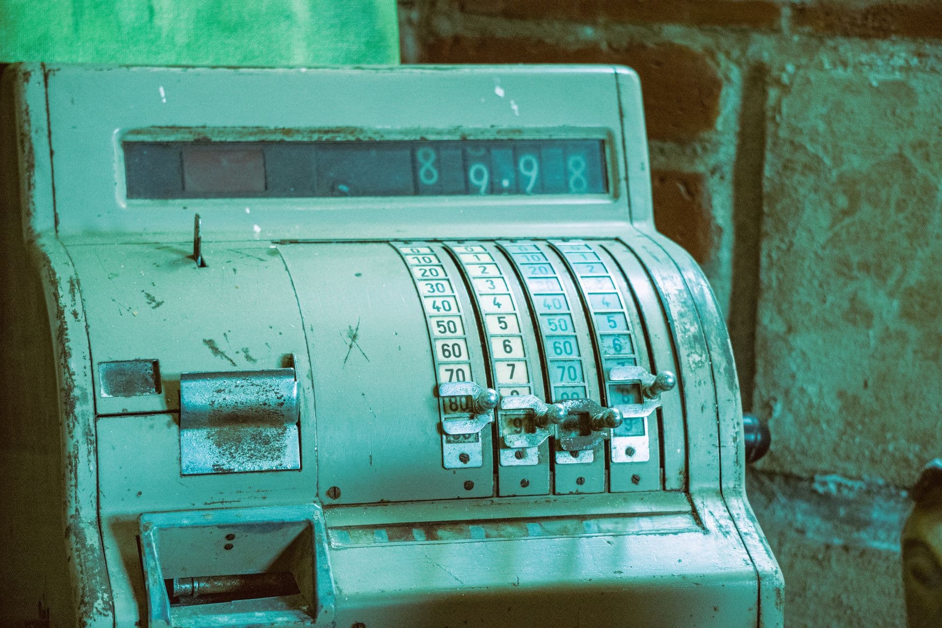
How to Create an Animated Number Counter
A step-by-step guide to building a number counter that actually lands: picking the number worth this treatment, setting an honest start point, adding the context that makes it mean something, and exporting an animated version for a launch post, a deck, or a milestone update.
Read article →

11 min read
How to Build a QBR Dashboard
A practical guide to building the handful of charts a quarterly business review actually needs: the growth number, the bridge that explains it, the pipeline read, the KPI scorecard, and the roadmap for what's next.
Read article →