A spreadsheet is where data goes to be correct. It is not where data goes to be understood. Every figure is right there in its cell, perfectly accurate and almost completely unpersuasive, because a grid of numbers asks the reader to do all the work: scan the rows, hold the values in their head, spot the pattern, and figure out why it matters. Most people will not do that work, especially not in a deck on a Tuesday afternoon or a feed on their phone.
The fix is almost never more spreadsheet. It is taking the exact same numbers and turning them into a picture that makes the point for the reader. And for most business data, an animated picture does it best, because the thing you are usually trying to show, growth, decline, a shift, a drop-off, is a change, and change is something a chart can act out rather than just state.
Below are six kinds of data you have almost certainly presented as a table or a spreadsheet, and the animated chart each one should become instead. For every pair: what the spreadsheet shows, what the chart shows, and why the chart wins. The numbers are illustrative, so use them as patterns for your own.
1. A row of KPIs → an animated number counter
The spreadsheet: a row of headline metrics, ARR $1.2M, customers 3,400, NRR 112%, sitting in cells with a label above each. Accurate, and completely inert.
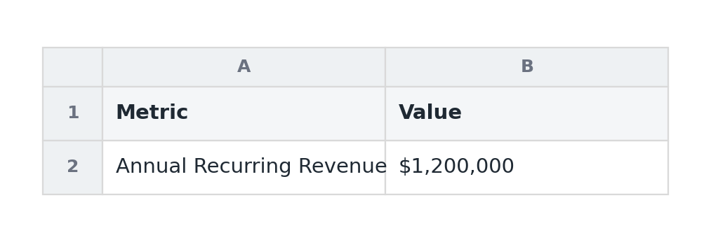
Why the chart wins: when the story is a single important figure, or a few of them, a table buries the number among gridlines and column headers. Pull each metric out as an animated number counter and the figure counts up to its value, and the moment it lands, especially on a round milestone like $1M, becomes a small event. A number still moving is almost impossible to skim past, where a cell is the easiest thing in the world to ignore. For a set of headline metrics, a KPI scorecard does the same job for several figures at once.
The rule: if the value is the story, give it the whole frame and let it move. Do not make people find it in a grid.
2. A month-over-month table → an animated line
The spreadsheet: twelve columns, one per month, with a revenue or signups figure under each. The trend is technically present, but you have to read all twelve cells and mentally plot them to see it.
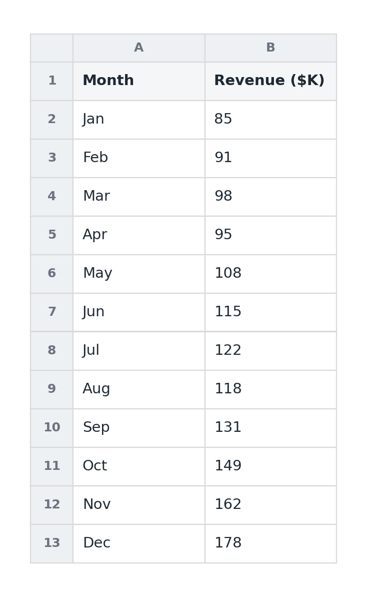
Why the chart wins: a line chart does the plotting for the reader, and an animated one draws itself on from left to right so the trend is something they watch happen rather than reconstruct. A slope that steepens reads instantly as acceleration; a dip is obvious the moment the line drops. The spreadsheet has the same information, but it makes the reader become the chart, and most will not bother. Twelve months is exactly the point where a line decisively beats a table.
The rule: when there are many time periods, never make people read the trend out of cells. A line shows it; an animated line performs it.
3. A funnel laid out as rows → an animated funnel
The spreadsheet: stages down the left, visits, signups, activations, paid, with counts and conversion percentages beside each. You can find the leak, but only by comparing numbers row to row.
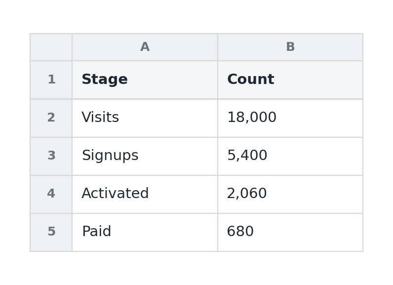
Why the chart wins: a funnel chart makes the drop-off physical. Each stage narrows toward the next, and animating them shrinking in sequence makes the biggest leak impossible to miss, you see where the business loses people rather than calculating it. A table tells you activation is 38%; a funnel makes you feel the cliff between signup and activation. That visceral quality is also why funnels travel so well on a feed, something we covered in the animated LinkedIn chart guide.
The rule: when the story is conversion or attrition through stages, shape beats numbers. Let the narrowing carry the message.
4. A "this year vs last year" grid → animated grouped bars
The spreadsheet: two columns of monthly figures, this year and last, side by side, leaving the reader to subtract one from the other in their head to see whether things improved.
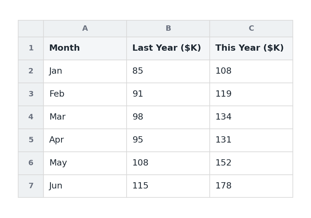
Why the chart wins: a grouped bar chart puts the two values literally next to each other for each period, so the comparison is a glance instead of arithmetic. Animating the pairs in makes the gap, this June towering over last June, land as a single clear impression. The reframe a comparison provides, a "flat" month revealed as well up year-over-year, is exactly the kind of insight a two-column table hides in plain sight. For just a couple of series over many periods, two lines on a line chart do the same job.
The rule: a number alone is ambiguous; a number against a benchmark has meaning. Show the comparison, do not make people compute it.
5. A revenue-bridge table → an animated waterfall
The spreadsheet: a list of pluses and minuses, starting revenue, new business, expansion, churn, ending revenue, that only add up to a story if the reader carefully tracks the running total down the column.
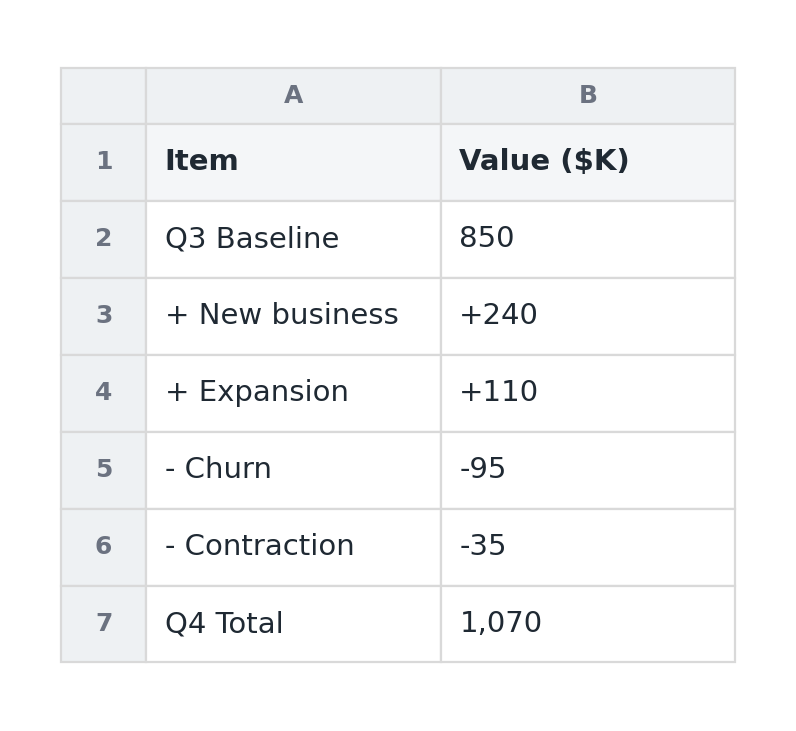
Why the chart wins: a waterfall chart turns that column of plus-and-minus into a visual sentence: it starts at last period's total, steps up and down through each driver, and lands on the new total, with each step animating in turn. The reader sees cause and effect, this is what added, that is what took away, instead of reconciling a list. It is the single most articulate way to explain why a number changed, which is why it belongs in an investor update or a QBR.
The rule: when the interesting part is why a total moved, not just the total, a bridge beats a list of adjustments every time.
6. A breakdown table → an animated donut or bar
The spreadsheet: revenue or users split by category, plan, segment, channel, as a column of figures with percentages beside them. To grasp the composition, the reader has to add the parts and weigh them against each other.
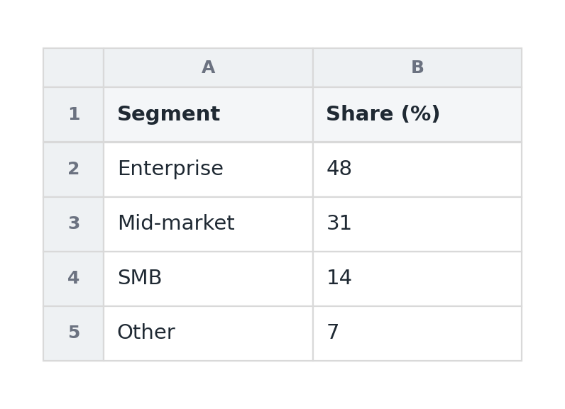
Why the chart wins: a donut chart shows composition as a whole at a glance, the dominant slice obvious, the surprise (one channel quietly driving half of revenue) immediate. Animating the slices in draws the eye to the proportions. The caveat is restraint: this only works with three to five categories, so bucket the long tail into "Other." When precise comparison between the parts matters more than the sense of a whole, a bar chart sorted largest to smallest is the more honest pick.
The rule: composition is a picture, not a column. Show how the whole divides, but keep it to a handful of parts.
The pattern behind all six
Notice what the move actually is in every case. The spreadsheet was never wrong, it had all the right numbers. It just outsourced the hardest part, turning data into meaning, to the reader, and readers do not accept that job. The chart does that work for them: it plots the trend, narrows the funnel, bridges the totals, weighs the slices. And animating it does one more thing, it makes the change the chart is built to show into something the reader watches unfold, which is far stickier than a static result.
So the next time you are about to paste a screenshot of a spreadsheet into a deck or a post, ask one question: what is the single thing I want them to take away from this grid? Then build the chart that delivers that one thing, and let it move. The data is already in your spreadsheet. The story is not, and the spreadsheet is the last place it will ever come out.